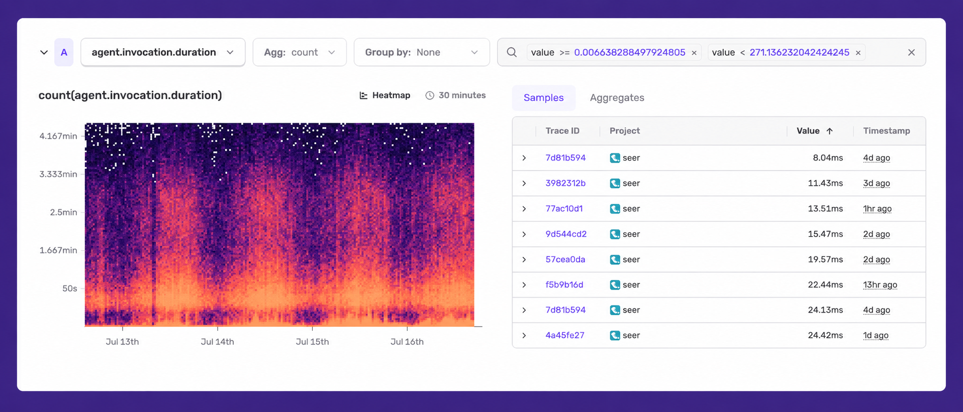
Heatmap visualization for Application Metrics
1 featureThis release1 featureNew capabilitiesAI-tallied from the release notes
From the original release noteView original ↗
Heatmaps are a new visualization for Application Metrics that let you see both the distribution of metric values and how those distributions change over time.
They're useful for spotting patterns that other visualizations can miss, such as:
- Whether increases in latency correlate with bursts of requests.
- Whether distinct user cohorts are experiencing dramatically different latencies.
To use Heatmaps:
- Choose a distribution type metric.
- Choose Heatmap from the visualization dropdown.
Heatmaps are also available in Custom Dashboards when using the Application Metrics dataset.
Want heatmaps for other datasets, like logs or traces? Or have other feedback? Reach out on Discord.
Application Metrics is available to every Sentry user. Read the setup docs for your language.
Fetched July 16, 2026