Security Center - Cloudforce One Threat events graphs are now visible in the dashboard
We have introduced dynamic visualizations to the Threat Events dashboard to help you better understand the threat landscape and identify emerging patterns at a glance. What's new:
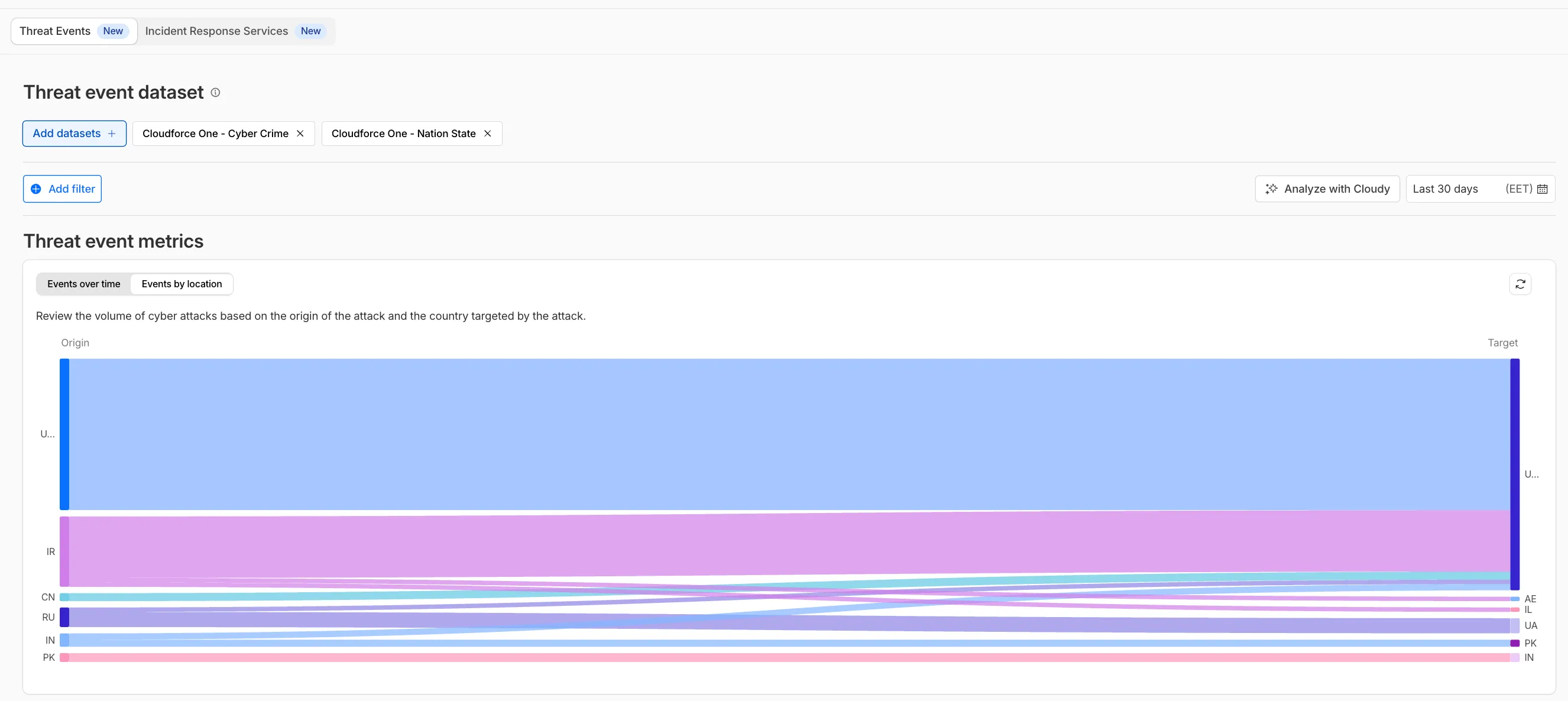
Sankey Diagrams: Trace the flow of attacks from country of origin to target country to identify which regions are being hit hardest and where the threat infrastructure resides.
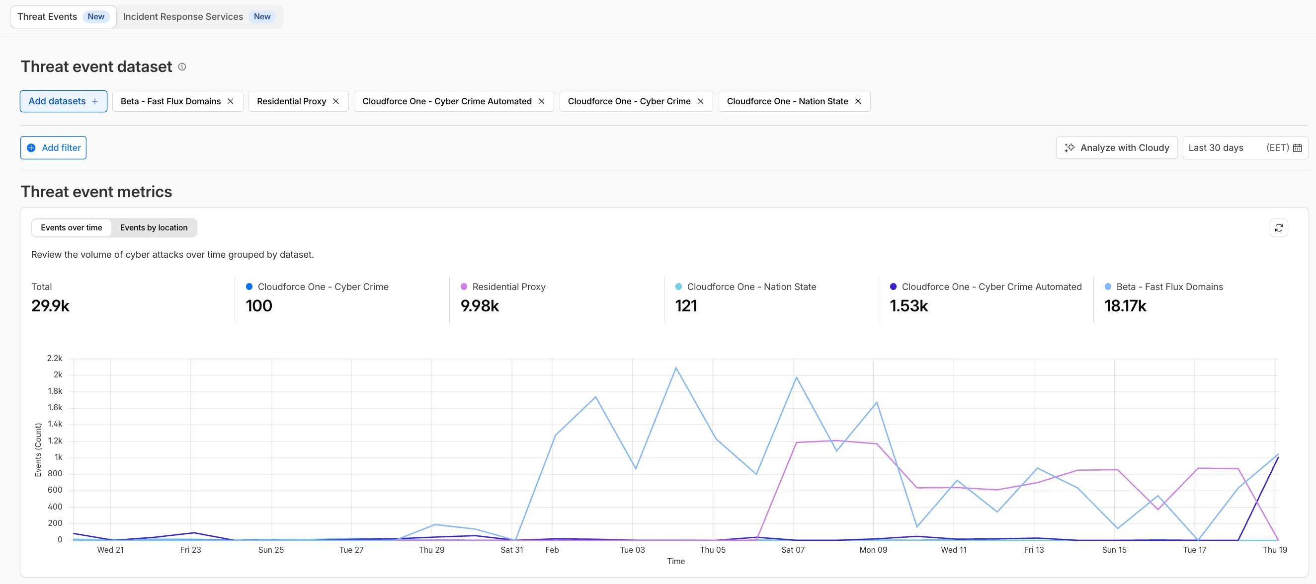
Dataset Distribution over time: Instantly pivot your view to understand if a specific campaign is targeting your sector or if it is a broad-spectrum commodity attack.
Enhanced Filtering: Use these visual tools to filter and drill down into specific attack vectors directly from the charts.
Cloudforce One subscribers can explore these new views now in Application Security > Threat Intelligence > Threat Events.
Fetched April 4, 2026